The Tiny Room Sign That Tries to Say Too Much
A crowded room sign can hide its main cue. Learn how wording, layout and placement help visitors spot the right instruction in the room.
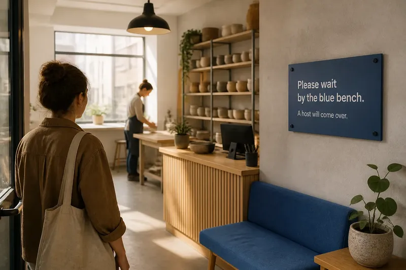
A visitor steps into a shared studio and stops beneath a low pendant lamp, unsure whether to queue at the desk or wait by the door. A tiny room sign may contain the answer, but if it competes with furniture, glare and other notices, the room itself can make that answer hard to find.
Editing a room sign means more than cutting words. The message has to fit the space where it will be read: the approach, the sightlines, the lighting and the way people move through the room.
How does the room change what a sign needs to say?
A sign is read from a particular position, often while someone is walking, carrying a bag or watching for another person. A phrase that seems obvious at a desk can become vague beside a doorway, where several routes and waiting spots compete.
Look at the room from the reader’s approach. Note the first thing they can see, where they must choose a route, and what could block the sign: an open door, a coat rack, a queue or a tall plant. Put the information before the decision it supports, not after it.
Room details can also supply useful landmarks. “Wait beside the green sofa” works only if the sofa is visible from the entrance and recognisable to a newcomer. If furniture moves often, name a more stable feature, such as the reception desk or the marked floor area.
Which sign message should lead?
Lead with the action a visitor needs to take at that spot. Add a location or a short explanation only when it makes the action easier to carry out.
- Action: What should the reader do? For example, “Wait”. If the action is missing, add a direct verb; if the reader already knows what to do, remove an unnecessary preamble.
- Location: Where should they do it? For example, “Beside reception”. If the place is visible and unmistakable, keep the wording brief; if several spots could fit, name a recognisable landmark.
- Context: What detail changes the next decision? For example, “A host will come to you”. If it resolves a likely question, retain it; if it merely repeats the action, move it elsewhere.
- Room conditions: Can the reader see the sign from the approach, without glare or an obstruction? If not, move or angle it; if the view is clear, avoid adding a duplicate sign without a reason.
- Surrounding notices: Does another sign compete with the main instruction? If both claim equal attention, separate them by purpose or location; if they support the same decision, group them clearly.
- Materials and finish: Does the surface catch reflections or blend into the wall? If the words disappear under the room’s lighting, change the finish or contrast; if they remain distinct, keep the simpler material.
Say a shared ceramics studio has a narrow entrance, a bright window opposite the door and a blue bench beside the reception desk. The organiser first notes that a glossy notice reflects the window and that visitors stop in the doorway; they move the sign to the wall beside the bench, choose a non-glossy finish, and replace a paragraph with “Please wait by the blue bench” plus a smaller line saying a host will come over. The expected observable result is that the waiting point is named where visitors can see it, while the smaller explanation remains secondary; the trade-off is that any change to the bench’s location would make the wording less reliable.
How do layout, light and materials affect legibility?
Visual hierarchy is not only a choice of type size. The sign’s position, the wall behind it, the light falling across it and nearby objects all affect which words stand out first.
Give the main instruction a clear focal position, then set supporting information beneath it with visible space between the two. Avoid placing the sign where a pendant shade, glazed door or polished surface creates glare. A matte finish can reduce distracting reflections; a strong contrast between lettering and background helps the message separate from a busy wall.
Consider the room’s materials before adding decoration. A pale paper notice on a pale plaster wall may disappear, while a dark board can feel visually heavy on a narrow passage wall. Test a simple arrangement in the actual spot and check it from the approach, both with the room in use and with doors in their usual positions.
An arrow can help at a junction if it points towards a visible destination. Colour can identify a zone when the same colour is used consistently, but it should not carry the meaning alone; pair it with words so the route remains understandable in changing light or to someone unfamiliar with the space.
Where should a sign sit in a room?
Place each sign where its reader needs to make the relevant decision. A direction belongs before a turn; a request to wait belongs near the waiting place, where it does not send people into a doorway or block a shared route.
Check sightlines from the entrance and from likely points of approach. An open door may hide a wall notice, a queue may cover lower wording, and a mirror or glazed panel may throw light onto the text at certain times. If a route decision happens before the room entrance, a cue inside the room will arrive too late.
It is not worth covering every wall with duplicate signs. Extra copies can create visual clutter and make the space feel more like a noticeboard; use another cue only where a genuine blind spot or separate decision calls for one.
How can you tell if a room sign needs editing?
Read the sign from the position where a visitor encounters it, not only at arm’s length. Check whether the first action is obvious, whether the location is identifiable, and whether the room’s light or layout hides any essential words.
- Find the main action. If it is buried mid-sentence, move it to the start or give it a separate line; if the action is already immediate, keep it and review only the secondary wording.
- Check competing headings. If two phrases look equally urgent, decide which one matters at that location and make it dominant; if they concern separate decisions, give them distinct positions or signs.
- Test the landmark. If “here” could mean several places, name a stable feature; if the landmark is visible and unambiguous, keep the shorter wording.
- Look for glare and blockage. If light reflects off the surface or furniture masks the text, change the angle, finish or position; if the words remain clear from the approach, do not add decorative contrast for its own sake.
- Separate unrelated rules. If a cleaning reminder distracts from a direction, move it to the relevant work surface; if both messages affect the same immediate action, group them with clear visual separation.
- Read every line aloud. If a sentence contains requests that belong in different places, split or remove them; if each line supports the same decision, retain the concise sequence.
For rules governed by a venue policy or local requirements, check the relevant guidance rather than improvising. For ordinary room cues, ask whether the wording and its position help a newcomer decide what to do next.
What do readers ask about crowded room signs?
How many words should a small room sign use?
There is no single word count that fits every room. Use only enough wording to name the action and make its location or meaning clear from the place where the sign will be read.
Should a room sign use full sentences?
Not always. “Please wait by reception” is a complete, direct cue, while a less familiar instruction may need a short explanation after the action.
Can icons replace words on a room sign?
An icon can reinforce a familiar direction, such as an arrow towards a visible doorway. If its meaning could be unclear to a visitor, pair it with a few precise words rather than asking the reader to guess.
What should be removed from a crowded room sign?
Move greetings, background information and reminders elsewhere when they do not affect the decision at that point in the room. Keep details that resolve real uncertainty, such as which entrance to use or where to wait.
How can a sign stay clear without sounding abrupt?
Direct wording can still be courteous. “Please leave this table clear for the next group” gives a specific request in a civil tone, without surrounding it with several explanations.
A brief reason can help when it answers an obvious question: “Please use the marked shelf; this cabinet is for staff.” But a reason that repeats what the room already makes clear adds little, especially if it pushes the action further down the sign.
For a tiny room sign, the useful edit is often to connect the message to the room’s actual layout: name a visible place, position the sign before the decision, and choose a surface that stays readable in the available light. Keep only the supporting detail that changes what a visitor does next.